
Box art is incredibly important in the board game industry. Not only are board game boxes beautiful, they are also iconic. People love looking at board game boxes – just check out Instagram sometime. There are whole accounts dedicated to showing off board game boxes!
Looking for more resources to help you on your board game design journey?
Here you go: no email required!
Like this writing style?
Check out my latest blog on marketing here.
People judge books by their covers. This is true for board games, too. The naive designer may lament that board gamers are only looking at the surface, not seeing the mechanics or the potential for incredible gameplay. It’s a valid complaint, but the simple fact is that board game boxes are a huge part of board gamers’ decision-making process when it comes to making purchases. Your board game box is the most important art you’ve got – make it count!

(If you’re looking for regulatory or legal requirements for packaging, check this article instead: How to Create Board Game Specs and Files for Your Printer.)
The Board Game Box as a Marketing Tool
Board game boxes serve not just as beautiful objects for their own sake, but also as critical means of communication between you and your potential customers. That includes the obvious stuff you normally see on boxes – the name of the game, the designer(s) and publisher, the age range, play time, and player count. But that also includes the messages you send about your game through your art. Through symbolism, you need to communicate most or all of the following information:
- The complexity of your game
- The “weight” of your game
- The amount of components your game has
- How long it takes to play
- The theme of your game
- The “hooks” that make people want to buy the game
Your box communicates not just through its cover, but also its size, and the information you provide on the back. People associate light games with small boxes and heavy games with big boxes. When gamers see a thick box, they expect a lot of components. If the art is whimsical, they expect it to be light-hearted. If the art is gritty and detailed, they expect it to be complex or dark.
Board Game Boxes & Perfection
The perfect game doesn’t exist. Games are only perfect for specific gamers. You need to attract the right kind of gamers by giving them all the information they need to know whether your game is right for them. Many gamers – wittingly or unwittingly – use their intuitive sense of what a game is or isn’t based on how it looks. That means you need to imply the essence of your game with your packaging. You have to send the right signals.
This is a really complicated concept. There is a field of study called semiotics, which is dedicated to understanding how people interpret signs, symbols, and metaphors. You don’t have to be studied in what they call the Saussurean tradition to understand how this works in board gaming. All you have to do is look at similar board games that sell well.
Look at the boxes of games similar to the one you’re making. You want it to be as similar as possible in the six qualities I listed a few paragraphs ago. Use Kickstarter and Amazon to look at some board game boxes. Look at them until you get a sense of what your own game box should look like. Copy the style you see, but still express your own personality.
When in doubt, follow the “Instagram rule” when designing board game boxes. Put a clear object in focus, use lots of detail, and make sure there is a sharp contrast between the foreground and background. That way, people will stop scrolling and look at your box online. In the store, it’ll catch their eye.
Real Examples of Board Game Boxes
As you can see, there are no hard and fast rules when it comes to designing board game boxes. For that reason, I’ll be looking at the board game boxes of the five games highest up on the Board Game Geek hotness list. I’ll be analyzing each one and explaining what I think it works. By sharing my methods, I hope you’ll be able to develop your own 🙂
Board Game Box 1: Gloomhaven
Good grief, look at this monster of a box! It’s wide, it’s deep, and it’s tall. Just seeing this on the shelf, you know you’re getting in for a heavy experience. With a weight of 3.77, this is definitely considered a heavy game on Board Game Geek. It’s usually priced at $150 or more, but you get a lot of parts.
The box art itself communicates a massive, complex world. It’s not a happy one, though. The name and color palette suggest otherwise. There is something to look at it in practically every corner of this box. There’s somebody hiding with a dagger in the bottom left, a creature playing cards near the bottom right, and decorative ribbons in the upper right.
Then when you look at the back, it shows off the minis and explains how the game works. This is really important because showing off components has shown to be one of the best ways to get and hold the attention of gamers.
Board Game Box 2: Root

Root is a different kind of game than Gloomhaven, and the box art immediately makes it clear. Like Gloomhaven, it’s a fairly heavy game and it comes chock full of a lot of components. The box is fairly large, but not nearly the size of Gloomhaven. It’s a slightly shorter game.
Root has a veneer of whimsy – little woodland creatures. Underneath that, though, there’s a complex game with mechanics such as engine building and area control. The game openly displays its darkness, intrigue, and complexity by arming the woodland creatures with dangerous weapons on the box. The size of the box and the price point also help establish the true weight of the game, so no one is surprised by it being too long or complex.
I juxtapose this with Gloomhaven to make a point – you have two complex games with two different tones. There are ways you can communicate the different tones without burying the true complexity of the game in the process.
Board Game Box 3: Between Two Castles of Mad King Ludwig
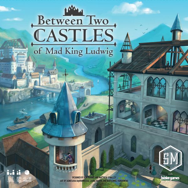
This game is fairly light and the price point hasn’t been released yet. It takes a bit under an hour to play and Board Game Geek gives it a 2/5 on the weight rating. The art painterly and peaceful, unlike the more conflict-driven games that we’ve shown above. You get the sense that you’re in for a more relaxing experience.
Board Game Box 4: Vampire: The Masquerade – Heritage

Little is known about this game at the time that I’m writing it. The art is minimalistic, showing a symbol, the name, and decorative framing. That’s pretty much all you have to go on. Yet even from this information alone, I suspect the game is going to be set in a dark, gloomy, conflict-driven world. That’s pretty amazing when you realize there’s essentially no art to go off of. That’s the power of symbolism.
Ask yourself: if you saw this in the store, what would you expect the game to be like?
Board Game Box 5: Terraforming Mars

Terraforming Mars is a new sci-fi classic. The name, the font, the picture in the center of the frame…all of these imply the sci-fi theme. If you pay close attention, you’ll notice the art doesn’t depict conflict, but you still get a vague sense of unease. I think it’s because of the prevalence of hard lines throughout the art, which give you a sense that you’re getting into a complex game. It’s subtle, but you can feel it long before you can recognize it.
Board Game Box 6: Tapestry

The second Stonemaier game on our list, Tapestry falls within the same basic category of Between Two Castles. However, Tapestry is a heavier, more complex game than Between Two Castles. It’s a strategy game in the subcategory of civilization game, which appeals to a specific audience.
The box art for Tapestry is appealing for a couple of reasons. First, it contrasts the ancient and the modern in a way that makes you look twice. Second, and most importantly, it mirrors the box art of Sid Meier’s Civilization in color, structure, and content. Basically, this box art is a clear reference to other games played by this game’s intended audience. That’s a smart move.
Board Game Box 7: Paladins of the West Kingdom
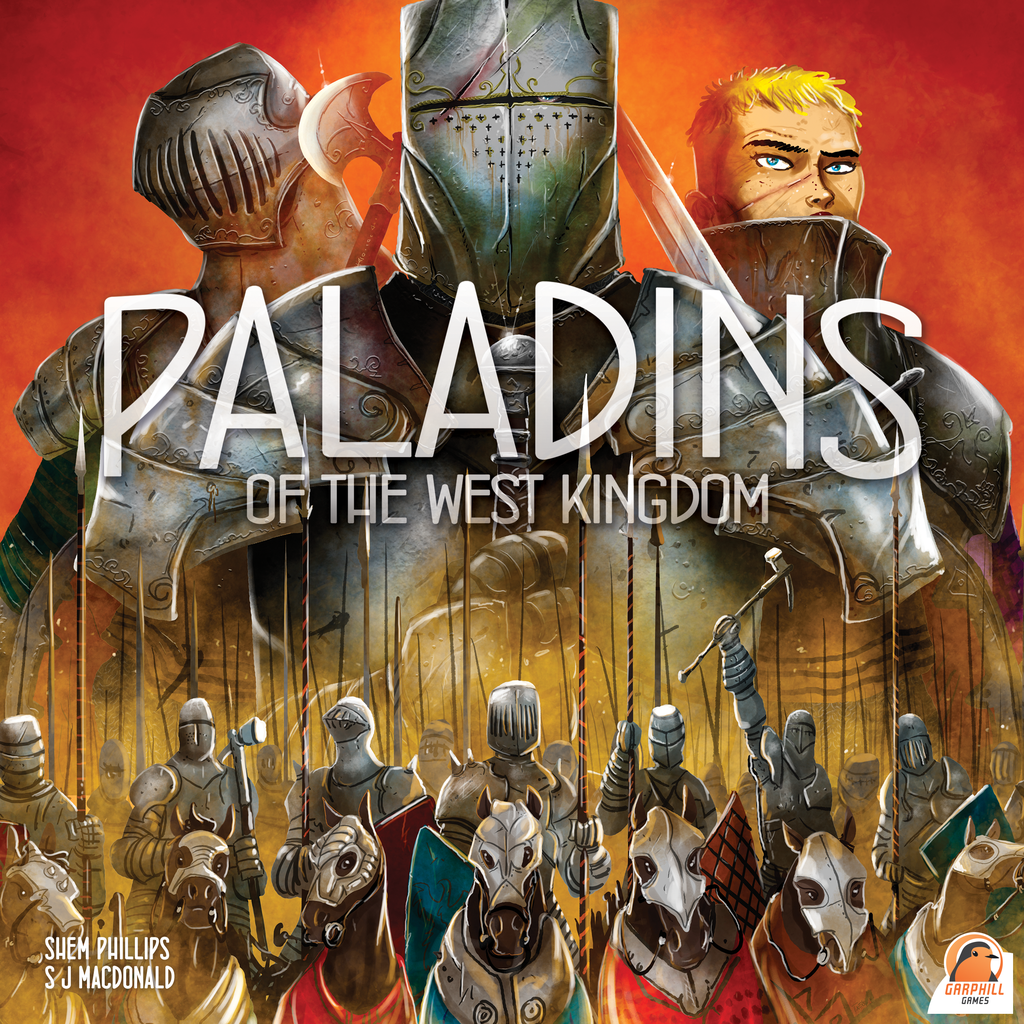
I’ve spoken at length about Paladins of the West Kingdom, but some points bear repeating here. Let’s say you’re going for a hardcore fantasy audience. I’m talking about the sort of people who read medieval fantasy novels such as Lord of the Rings and who play games that resemble the style of that famous series of novels.
So what do you do to reach out to that audience? You use the word “Paladins” in big text on the box. Emphasize suits of armor and medieval weaponry. Do all of this with contrasting, highly focused colors that look great on the shelf and in your Instagram feed, and voila.
Board Game Box 8: Parks
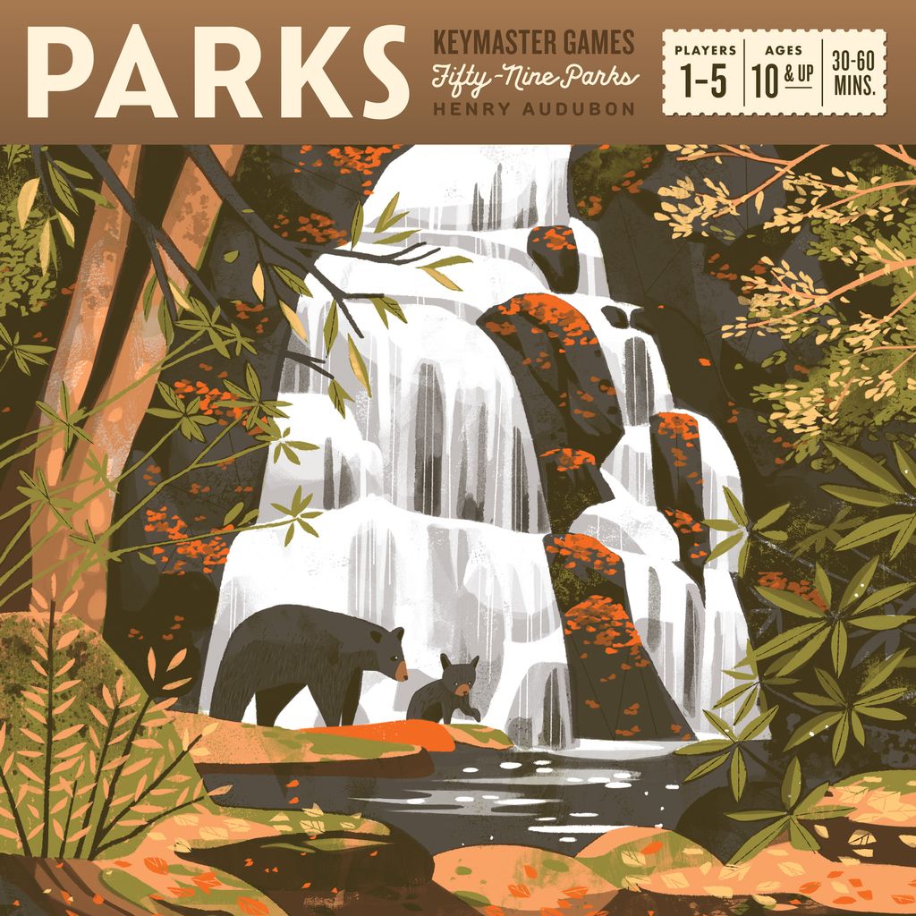
Parks is an entirely different sort of board game than anything else we’ve mentioned in this article. They completely commit to their theme by mimicking the style of classic US postcards. It’s a deliberate way of bringing up people’s nostalgic memories of Americana.
But there is one crucial aspect that cannot be overlooked. It does this all, but still with contrasting colors and a lot of detail. The modern attention-grabbing requirements of board game boxes are still captured in this art style, even though it originates from the Golden Age of Travel.
Board Game Box 9: Nemesis

Where Tapestry imitates Sid Meier’s Civilization, Nemesis imitates the movie Alien. The structure of this box art is deliberately close to the movie poster for Alien while borrowing the color palette from its action-packed sequel Aliens.
In short, this box art works because it deliberately and very clearly references a major franchise in pop culture.
Board Game Box 10: Wayfinders
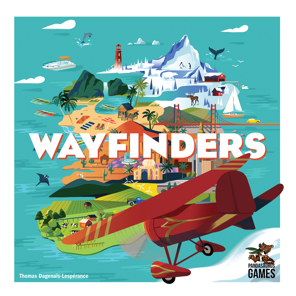
This last box art works for reasons very similar to Parks, but I think it’s worth including for a couple of reasons. First, the color palette is diverse, gorgeous, and eye-catching. Leave it to Pandasaurus to know how to use color to their advantage!
Second, this is a subtle detail that’s hard to see on the Internet, but very, very clear in real life. See how the plane’s bottom wheel and right wing overlap with the white area of the box? You can’t see it very well in this article, but on the shelf, that will make it look like the plane’s flying right at you like some kind of early 2010s movie that arbitrarily shoehorned in 3D. That is a really cool effect for a board game box!
Is there a board game out there with great box art that tells you what you’re getting into? Let me know in the comments below!


2 thoughts on “How to Make a Beautiful Board Game Box”
Iki. One of the most beautiful boxes ever. Front, back AND sides (so it looks beautiful just sitting on your shelf). The Japanese period theme just shines. It’s also a marvel of design inside the box. I am obsessed with this game!
Just looked at a photo of this online. This is a gorgeous game! You’d think Hokusai did the art.