Dev Diary posts are made to teach game development through specific examples from my latest project: Highways & Byways.
Just here for Highways & Byways updates? Click here – it will take you right to the updates at the bottom of the page.
This week, in Start to Finish: Publish and Sell Your First Board Game, I released Five Levels of Communication through Game Development. It’s about how to use subtleties to speak to your audience when you’re creating a game. You have very limited ways of communicating complicated concepts to your players with static cardboard and plastic, so what you imply and what you suggest through your game’s design is very important!
Looking for more resources to help you on your board game design journey?
Here you go: no email required!
Like this writing style?
Check out my latest blog on marketing here.
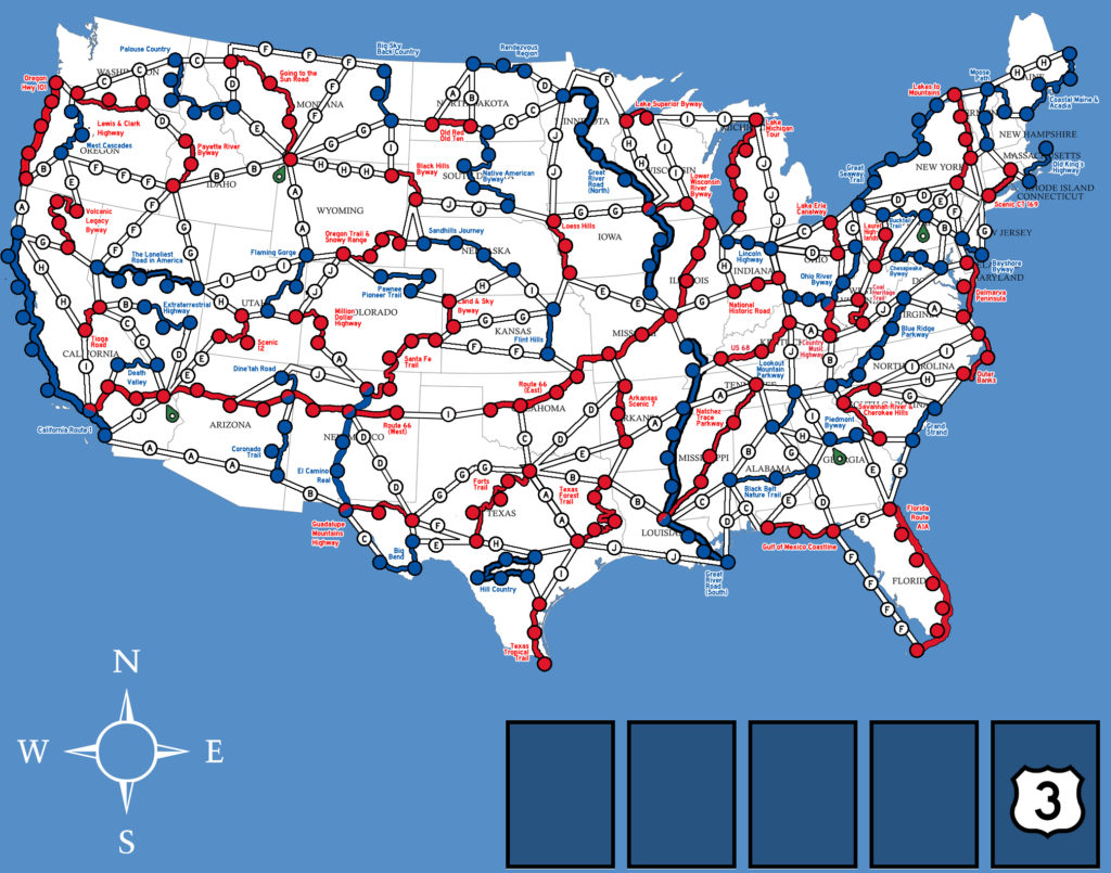
Turns out, this week’s development of Highways & Byways illustrates my point pretty well. I provided the following image to James Masino as a reference for creating the game’s board…

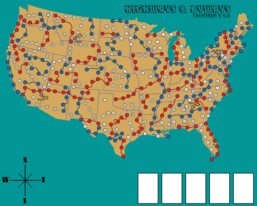
In a few short days, he turned around this early first draft of the Highways & Byways board…

Now James is by no means even close to done with his work. This is something he slapped together quickly as a demo because his real goal was just to outline the country and the road structure. We’re doing rapid prototyping. In fact, it’s somewhat unusual to commission artwork at this stage of a project, before it’s been blind play-tested, but I’m comfortable breaking this guideline for three very good reasons:
- It’s a map-based game and the main struggle with this game is how it communicates location-based information in an elegant way.
- The board art will be used for other parts of the game – so this is a high value-per-cost thing to go ahead and knock out.
- I can afford to bite the cost if we have to scrap it.
Now let’s talk about how James strengthened the game’s communication. He stripped the text labels completely. He stripped them from the roads and he stripped them from the states. At first I was convinced the presence of labels was a necessary evil, but we discussed a better way – which we’re experimenting with right now. Point is: removing text allows the game to talk without words, reducing the cognitive processing burden you’d feel looking at the board.
He smoothed out the curves of the byway roads, which made it look prettier and more approachable. This, too, is a good way of improving the way the board communicates.
Simplicity is really important when making games. You can’t cut all the details out of a game, but if you find yourself groaning at the complexity of something (like finding where a road is in the play-test versions of this game), you probably need to make it simpler.
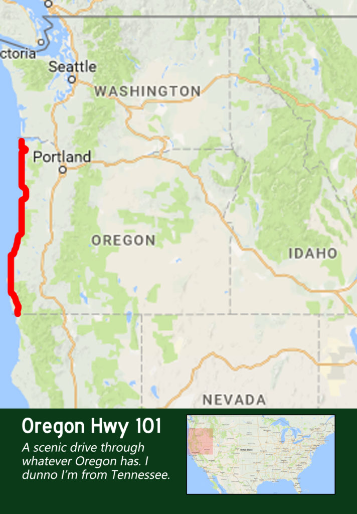
For Highways & Byways, the game hinges upon being able to quickly find over a dozen roads that you need to travel. My original idea of the game would have had you look up their location by state name, using the bulk of the “Byway Card” for beautiful art. Then play-testing revealed an easier-to-use and less expensive alternative: use a picture of the road, as it is on the board, to show where a player where to find the road.
I still thought “yeah, but we need labels” just in case the pictures weren’t enough. Then it hit me. What if we were to divide the USA into different color zones like Rolling America. If were to do that, the roads wouldn’t need labels at all! You could deduce the location of a road very quickly and reliably by the color of the states, the state border shapes, the shape/size/color of the road itself, and a mini-map that shows where the pictured portion on the card is relative to the United States as a whole.

James and I still have a ton of experimenting to do, but this just gives you a rough idea of how much thought goes into designing simple interfaces in board games. Highways & Byways is going to be a lighter game than War Co., and while it is shaping up to have a pleasantly surprising amount of strategic meat to it, I want people to be able to pick this game up in 5 minutes. That’s my goal – 5 minutes to learn to play, 30 minutes to learn to strategize.
Speaking of communication, this is tangential but important. You need people to challenge you. Sometimes we, as creative people, get too in our own heads and get stuck on bad ideas. That’s why we need professionals and play-testers to help us create our best work. I pushed James to add labels to the board and he pushed back saying, “we need to try something else first.” We may very well wind up using labels in the end, but if this experiment with color zones goes well, the Highways & Byways board is going to be way prettier to look at.
Seek out fresh opinions and always look for a way to communicate more clearly.
Most Important Highways & Byways Updates
- I have the earliest iteration of the board artwork from James now.
- It was going to be ready for play-testing, but we both want to improve the way information is shared on the board, so we’re trying another experiment first.
- Experimenting with breaking country into 7 color zones – without going too much into the rules, this could mean almost completely removing text from the game board AND reducing the text on Event Cards.
- While James and I have this back and forth going, I’m continuing to grow my game dev Discord and the newsletter. They’ve both been unexpectedly delightful projects. They are both vastly outpacing my estimates for audience, engagement, and that intangible feeling of people caring.
- I’m getting ahead on Start to Finish blog posts to build a backlog for when I go HAM on play-testing.
- I reiterate what I said last week. “I don’t have a lot of sexy updates this week. It’s nose-to-grindstone, ugly, early work for the next few weeks.”


